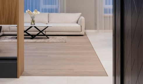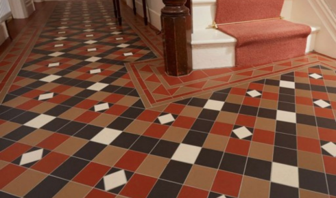
If you use a grout colour that strongly contrasts with your tile, every joint becomes a line on the floor. Sometimes that’s a design choice, but often it makes the surface look busier.
When grout is chosen to be close in shade to the tile—slightly lighter or slightly darker but in the same family—the eye reads the floor as one continuous surface. Joints visually recede, and the whole area feels calmer and more seamless.
This is especially nice in small rooms where too many lines can make spaces feel chopped up.